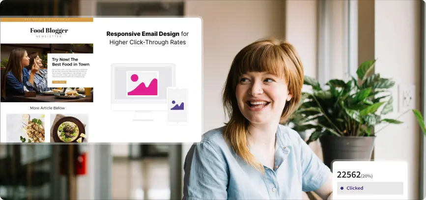

Responsive Email Design for Higher Click-Through Rates
Enhance email marketing with responsive email design. Boost engagement and improve click-through rates using best practices and kinetic email design.
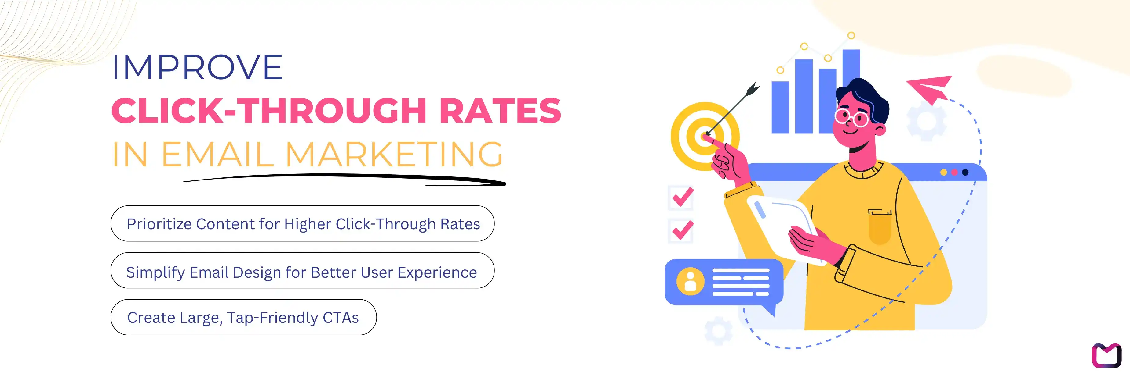
How to Improve Click-Through Rates in Email Marketing
Responsive Email Design Tips to Increase CTR
Email Design Best Practices for Long-Term Success
Frequently Asked Questions About Optimizing Email Design for Better Click-Through Rates
Conclusion: Increase Higher Engagement and Click-Through Rates with Responsive Email Design
Responsive email design plays a crucial role in increasing click-through rates in email marketing. As more people check emails on mobile devices, it is essential that your emails not only look good but also function seamlessly across different screen sizes. By ensuring that your emails are easy to read and interact with on any device, you can increase user engagement and increase higher conversion rates. Let's explore how responsive email design can optimize your email marketing strategy and lead to more successful campaigns.
How to Improve Click-Through Rates in Email Marketing
Prioritize Content for Higher Click-Through Rates
The majority of email opens now occur on mobile devices, making it crucial to prioritize your content for better click-through rates. Here's how you can optimize:Position Key Information at the Top
: Ensure that your most important content, such as offers or CTAs, is visible at the top of the email. Users are more likely to engage if they can see what's most relevant to them without needing to scroll.
Create Engaging Subject Lines for Attention
: The subject line is the first point of contact with your audience. Use compelling language, keep it concise, and focus on creating a sense of urgency to encourage higher open and click-through rates.
Use Clear and Concise Messaging
: Avoid lengthy paragraphs and use bullet points or short sentences to communicate your message quickly. Clear messaging helps users easily understand the purpose of your email and drivs more clicks.
Simplify Email Design for Better User Experience
A cluttered design can distract users and reduce engagement. Simplify your email design to create a more user-friendly experience:Limit Color Palette and Font Choices
: Using too many colors or fonts can overwhelm the reader. Stick to 2-3 complementary colors and a maximum of two font styles to maintain a clean and professional look.
Utilize White Space for Improved Readability
: White space is an important design element that can help separate sections of your content, making the email easier to scan and improving readability.
Highlight Calls to Action
: Ensure that your CTAs stand out by using contrasting colors and placing them in prominent positions. Use action-oriented language to increase the likelihood of engagement.
Create Large, Tap-Friendly CTAs
CTAs are critical to increasing clicks, so make them easy to interact with:Ensure Prominent Visibility of CTAs
: Position your primary CTA where it is immediately visible when the email is opened. This will catch the reader’s attention and prompt immediate action.
Design for Mobile Users with Accessibility in Mind
: Consider mobile-first design by using large, tap-friendly buttons to accommodate different screen sizes and reduce the chances of misclicks.
Use Action-Oriented Language for CTAs
: Encourage consumers to click by using direct and obvious wording such as Shop Now, Learn More, or Sign Up. Avoid vague or passive phrases that do not convey a sense of urgency.
Responsive Email Design Tips to Increase CTR
Implementing responsive email design goes beyond aesthetics; it's about making emails function optimally on all devices. Here are some responsive email design best practices you can follow:
Implement a Single-Column Layout
A single-column layout is easy to navigate and works well on small screens. This layout simplifies content flow, ensuring that all elements remain in view without the need to zoom or scroll excessively.Optimize Fonts and Images for Mobile Devices
Choose Readable Fonts and Sizes
: Use web-safe fonts and maintain a minimum font size of 14px for body text and 22px for headlines. This makes your content legible on both desktops and mobile screens.
Ensure Images are Responsive
: Use flexible image sizes that adapt to screen variations. Set image widths to 100% and avoid fixed dimensions to prevent distortion or cropping on smaller screens.
Incorporate Eye Catching Elements
Eye Catching elements, such as interactive polls or forms within emails, can increase user engagement and lead to higher click-through rates. Incorporating kinetic email design elements like AMP for email adds interactivity that allows users to engage directly from the email itself.Test Emails Across Multiple Devices
Test your emails on different devices and email clients to identify any display issues. Consistent testing ensures that your content looks as expected, regardless of the platform used to view it.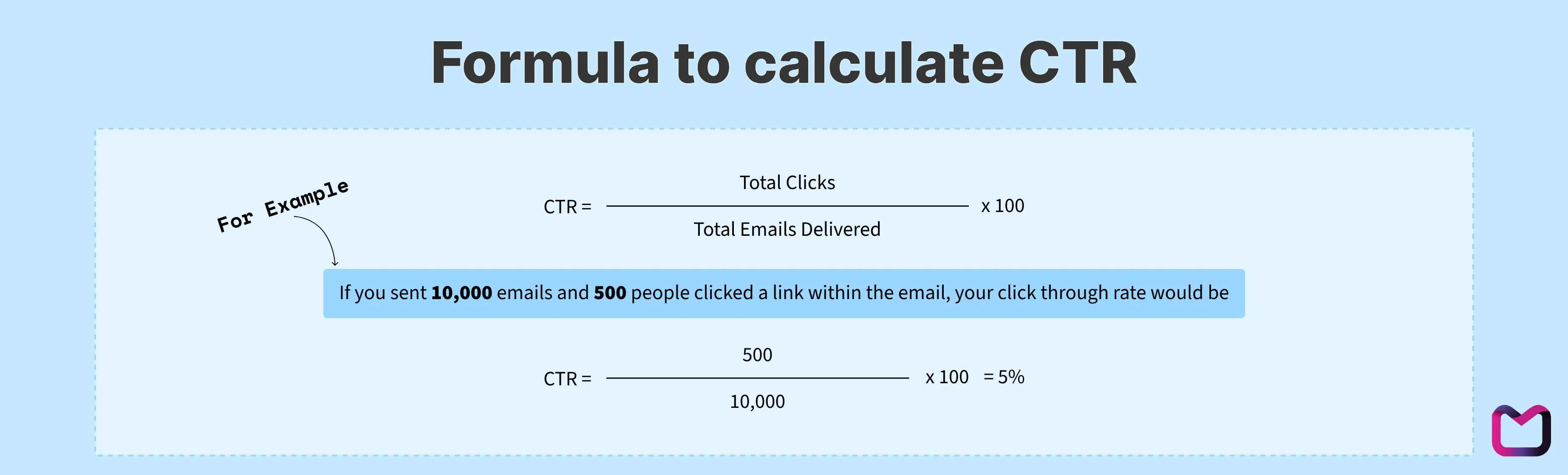
Email Design Best Practices for Long-Term Success
Maintain Consistent Branding Across Emails
Consistent branding strengthens your company's identity and fosters trust among your consumers. Use the same logo, color scheme, and tone of voice across all emails.Focus on User Experience (UX) Design Principles
Design your emails with the user in mind. This includes easy navigation, quick load times, and content that aligns with the needs and expectations of your audience.Implement Consistent Testing and Analytics
Conduct Regular A/B Testing
: Test different elements such as subject lines, layouts, and CTAs to see what resonates best with your audience. Regular testing helps optimize performance and improves click-through rates.
Analyze Performance Metrics for Continuous Improvement
: Use data from previous campaigns to identify patterns and areas for improvement. Focus on metrics such as open rates, click-through rates, and conversion rates to fine-tune your strategy.
Frequently Asked Questions About Optimizing Email Design for Better Click-Through Rates
What are the best practices for mobile-friendly email design?
Some responsive email design best practices include using a single-column layout, optimizing images and fonts for different devices, and ensuring CTAs are large and easy to tap. This helps create a seamless experience across mobile devices.
How can I optimize my email design for better engagement?
To optimize your email design, focus on personalizing content, using interactive elements, and prioritizing key information at the top of the email. These strategies will help increase user engagement and improve click-through rates.
How often should I test my email design across different devices?
It's important to regularly test your emails on various devices and platforms before each major campaign to ensure consistency. This prevents formatting errors that could negatively affect user experience and engagement.
What type of content increases higher click-through rates in responsive emails?
Clear, action-oriented CTAs, engaging copy, and personalized interactive content tend to increase higher click-through rates. Keeping the design simple and focusing on user interaction encourages recipients to click on the content.
Conclusion: Increase Higher Engagement and Click-Through Rates with Responsive Email Design
Responsive email design plays a crucial role in improving click-through rates and increasing engagement. By focusing on mobile-friendly design, optimizing layout and content, and following responsive email design best practices, you can create emails that resonate with your audience and encourage action. Ensuring that your emails are visually appealing and functional across all devices is essential, as it directly impacts user experience. This involves not only aesthetic considerations but also strategic placements of content and calls to action that facilitate interaction. Whether you're aiming to increase engagement or conversions, a well-designed, responsive email is key to improving your marketing outcomes.
To learn more about how responsive email design can increase your click-through rates and increase your email marketing success, explore our expert tips and strategies with Mailzzy today. Let us help you craft emails that deliver results and engage your audience effectively
Also read

From A to Z: An Email Marketing Glossary for Beginners and Experts
Explore key email marketing terms in our glossary. Understand deliverability, automation, segmentation, and more to improve your email campaigns.

Creative Valentine's Day Email Ideas to Capture Hearts & Boost Sales
Get inspired with 100+ creative Valentine’s Day email campaign ideas to engage customers, boost sales, and drive results this season.

Designed to meet WCAG 2.1 AA
Let's keep in touch
Sign up for our weekly email marketing newsletter and Mailzzy updates.
For more details, review our Privacy Policy


© 2026 Mailzzy. All rights reserved.

